Sushi-Inspired CSS 3D Navigation for jQuery :
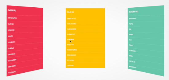
Justin Windle aka soulwire, born in the UK, but now living in the United States, developed Makisu, a concept resembling the older Paperfold CSS, but going much farther than that. It is actually easily implementable in live websites through its iteration as a jQuery plugin. The strange name stems from the Japanese language, where a Makisu is a bamboo mat used to produce a certain kind of sushi or just to squeeze moisture out of fruits and other overly moist nourishments.
Justin Windle’s Makisu can not be used to produce sushi obviously, neither can you squeeze fruit-juices with it. Anyway, take a look at it and you’ll immediately understand the name. The Makisu navigation menus unfold like a bamboo mat let loose while held on one side. The navigation items roll out and the virtual bamboo mat even swings back and fourth, making for a realistic effect. The dropdowns are made up of list items, one per line. These items can be toggled to show or stay invisible. Unfolding the dropdown leads to the bamboo effect.
Makisu is a mere CSS concept using CSS 3D transforms. As such it only works in some of the most recent versions of browsers, as they are Chrome, Firefox, Safari, and the standard browsers in Android, iOS and Blackberry. Internet Explorer 10 should also be displaying Makisu correctly. As I am testing some of the most recent Ultrabooks at the moment I took one and fired up IE 10 to double-check if something that beautiful but at the same time demanding would really, I mean really as in real not really as on a spec paper, work in a Microsoft environment. I did not get disappointment, given that I expected it not to. Makisu actually works, but the whole experience is sluggish, slow and all the animation effects are left out. No elegantly swinging at the end of the process. Microsoft proves to be reliable…
Makisu as a CSS concept would not be very easy to implement into your own website. That’s why Justin wrapped a jQuery plugin around it. This makes implementation a snap. Simply call jQuery and the plugin in the head of your document and call the function like this:
The most important parameter is the choice of selectors. In the above shown example it is the regularly used li-element, but you could as well go more exotic and choose elements as to your liking. The other options refer to speed and overlapping. 3D effects are provided by the use of
perspective and vertex shading via shading.
Makisu can be downloaded and used free of charge from Github. It is only a few days old and – let me say it again – is a concept. If you are the adventurous kind you could of course put it on one of your live websites. Chances are your customers might complain. But boy, it really looks fancy.
Tooltips In Pure CSS3 And HTML5, No JavaScript Needed :
Tooltips in HTML pages general do not need any effort from a developer’s side, as long as they put proper title attributes to their elements. The title is then used for showing the tooltip, but also for other things, such as providing a screen reader with proper content. Speaking of the use case of tooltips, the visual presentation depends on the browser your site gets visited with. Developers with the need for more control turned to JavaScript bases solutions years ago. Kashagra Gour created Hint.css, which proves as a decent alternative, based completely on CSS and HTML.
Hint.css – Data Attributes, CSS3 Transitions, Pseudo Elements and the Content Property
Hint.css allows for relatively simple, yet stylish tooltips on any element you might find appropriate. Foremost we will be speaking about text, links and images. To have the tooltip shown, you will need to add at least two consecutive classes to the element chosen. The first class will always be called
hint, triggering the stylesheet initially, while the second defines the position or the visual appearance of the tooltip. You can add as many classes as you like to achieve as many combinations as possibly thinkable. If you would want to define the position as well as the color of the tip, you would simply add three classes, like so:
Would turn out looking like this:
Using
hint we stick Hint.css to the element. The class hint--top positions the tooltip above the span and hint--error defines the red visuals. The following data attributedata-hint carries the text to be shown (usually) on hover.
HTML5 data attributes are a possibility, to inject random data into a valid source code. Data inside of data attributes will not be shown to the visitor and don’t influence the design. Nevertheless, they are included in the page and can simply be read and processed by specialized scripts and methods, by Hint.css in our case.
In its recent form, Hint.css has definitions for
hint--top, hint--bottom, hint--leftand hint--right, used for the positioning of the tooltips. Moreover there are color definitions for common status messages such as hint--error, hint--info, hint--warning and hint--success. If you want your tooltips to always stay visible, thus not needing to be triggered on mouse hover, you will need to add the class hint--always.
As Hint.css represents pure CSS, the feature set can easily be extended by skilled developers. This applies to colors and other visual aspects in the first place. Skilled enough and stuffed with a little fantasy, you could push the limits even further. This is fostered by the fact, that Hint.css is developed in Sass, with the Sass sources also available. Hint.css can be downloaded from Github under the liberal MIT license, which allows for the usage in private as well as commercial projects.
If you are not into tooltipping at all, the stylesheet definitely is for you anyhow. Reduce it to the educational aspects. You will learn a lot from fumbling around the stylesheet. Hint.css is a 100% recommendation. What you might want to know, before I leave you to your own devices, is, that CSS transitions on pseudo elements only work in Firefox. Other browsers simply don’t show transitions which I would not have noticed, had I not tried in Firefox after I knew.
HTML Elements Become Parallelograms With Maskew :
You know that you can tilt HTML elements into the shape of a parallelogram using the CSS3 property “transform”. Nice, at first sight. But then, calling “transform” on a picture leads to tilting the picture itself. Uncle Hugo is not amused about his new skewed look. And you know, it is his corporation you are preparing the web site for. To save you, I have found the JavaScript library Maskew. Maskew skews elements into parallelograms too. But it does not skew the content, only the frame. Uncle Hugo himself will not tilt (at you) this way…
Nifty Frames, Easily Created
Freeforms for HTML elements are limited, even CSS3 does not break down all the borders. With minimum effort we are able to create circles, ovals and rectangles to mask pictures and other elements. Now with Maskew and thanks to JavaScript we can mask elements easily using parallelograms, too.
Operating Maskew is simple. Having embedded the small library, weighing in on only 5kb, you call it on any given element like this::
The Maskew object needs two variables. The first variable contains the element, the effect is supposed to be invoked on. The second variable defines the angle. Valid values range from 0, which leads to a rectangle, and 45 degrees.
Although Maskew comes without dependencies it can be used as a jQuery plugin too. So why not take the easy path, if you have embedded jQuery anyway?
Mouse Actions on Maskewed Elements
If you want to give your elements a little dynamics, you should add the option
touch. Touch allows for the change of angle using the mouse. Keep the right mouse-button clicked and drag the image over. A change in the cursor displayed tells you whether this possibility is active:
Conclusion: Maskew offers a nice effect to bring pictures and other HTML elements into the rather unusual shape of a parallelogram. Variation in routine is always a good thing, isn’t it..


